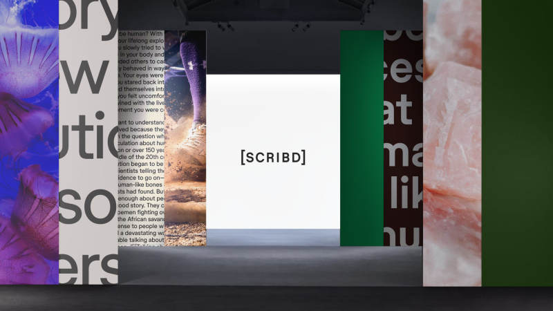
Founded in 2007, Scribd is a digital library and subscription service that provides access to a wide range of written and audio content. For almost two decades, it’s been a valued resource for everyone, from teachers searching for classroom resources to industry professionals looking for business plans and hiking enthusiasts hunting for trail maps.
But Scribd and the world around it (online and offline) have evolved since 2007, and its brand identity needed to evolve accordingly.
Recently, the platform has unbundled into three distinct products: the Scribd digital document library; Everand, which focuses on ebooks, audiobooks, magazines, and podcasts; and SlideShare, which focuses on presentations.
Previously, independent studio Mother Design successfully developed the identity for Everand. More recently, the company asked Mother Design to create a new identity around Scribd to boost growth, help it modernise and create a brand that feels aligned with the energy and opportunity it offers the world, namely, to democratise information.
Emotional benefits
To achieve this, the studio wanted to refresh the customer experience by making it simpler and easier to navigate while also seeking to increase engagement and loyalty.


To that end, the new identity needed to tap into the emotional benefits that Scribd brings to people’s lives beyond the purely functional, such as learning and enablement.
While other tech companies often default to bright, graphic-inspired heavy identities appealing to Gen Z, Scribd wanted to encourage an environment of research where people can discover everything they wish to know about a topic by diving deeper into its platform.
In a digital era of scrolling, editorialisation and AI-generated summaries, this approach counters the snackable, bite-sized content many of us consume today via hundreds of different online tools and apps. As such, Scribd is positioned as the alternative platform for knowledge-seekers who want to do the reading, find the source, or draw their own conclusions.
The brand platform has been fully titled ‘The Source: Life is an Essay, and we are its Bibliography’. This speaks to the deeper level of learning and understanding enabled by accessing Scribd’s content rather than surface-level skimming.
Visual elements
With this new visual identity, Mother Design has reimagined the Scribd brand as a contemporary content catalogue, offering additional, necessary context to life’s ideas and positioning it as the right place to not only learn something but truly understand it and achieve personal growth as a result.


The brand world draws inspiration from physical archives and libraries, visualising the iteration and synthesis of thoughts online. Ultimately, this establishes Scribd as the source for exploration and connection.
The new brand voice is quietly confident and detail-oriented, inviting users to investigate, share knowledge, and foster curiosity. The Scribd wordmark is framed in square brackets, referencing literary source lists and the learning journeys they inspire. With thick, sans-serif letters and wide spacing, it conveys a confident simplicity.
In collaboration with Store Norske Skriftkompani, Mother Design developed a modified typeface that incorporates bibliographic symbols. It uses brackets and superscript to enhance headlines and convey the essence of understanding.
The updated colour palette reflects the warmth and tactility of a physical archive to achieve a feeling of simplicity, distinguishing Scribd in a digital landscape. It uses green as a consistent, unifying accent to convey optimism, complemented by soft, earthy pastels across the user interface. Though refreshed, green has existed in Scribd’s colour palette since its inception, representing a nod to the brand’s roots.


The sense of endless discovery is further expressed through designs reminiscent of turning book pages and stacking documents. Indeed, before beginning the design work, the Mother Design team visited physical archives for inspiration, ensuring the digital brand resonates with its audience through tangible objects and spaces.
Brand rollout
The new brand identity is being rolled out globally across Scribd’s web platform and apps, supported by social media and marketing activity. Mother plans to continue collaborating with Scribd, Inc. this year to modernise and rejuvenate the brands in its portfolio.
“Scribd is a tool used by millions daily, yet its incredible drive for knowledge sharing and discovery has often been overshadowed by a functional branding approach,” says Jo Tulej, creative director at Mother Design. “In our collaboration with the Scribd team, we’ve created a brand positioning that encourages deeper understanding rather than hot takes, borrowing visual cues from physical archives and libraries.
“The new identity imagines Scribd as life’s bibliographer—a platform that gives people much-needed context to truly understand the big and small of everyday life.”
Gemma Craven, VP of brand marketing at Scribd, Inc., adds: “We leaned into our successful partnership with Mother Design to honour Scribd’s heritage as one of the first waves of internet brands while celebrating the product’s evolution into a fresh, necessary destination for knowledge seekers globally.
“This new brand identity reflects our mission to democratise the exchange of information, building a digital world of knowledge and interests that rewards users’ curiosity with deep discovery across every topic imaginable.”

